


Key takeaways
- The Fed’s dot plot is a chart that records each Fed official’s projection for the central bank’s key short-term interest rate.
- The dot plot is updated every three months and is meant to provide insight into the Fed’s future rate decisions, with the caveat that Fed officials can’t always predict the future.
- The Fed’s latest projections continue to signal two rate cuts for 2025.
After the Federal Reserve’s latest interest rate decision, you may be tempted to try and start connecting some dots.
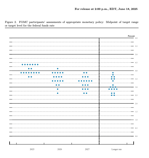
That’s because U.S. central bankers updated their closely scrutinized “Summary of Economic Projections” (SEP) at their June meeting, which includes a chart that many Fed watchers obsess over: the “dot plot.” This graphic indicates to consumers where each Fed official sees interest rates heading in the future, with the latest update revealing that policymakers still expect to cut borrowing costs twice in 2025.
But even though it seems comparable to getting a sneak peek at the winning lottery numbers — helping you predict good money moves, such as when it could be a good time to finance a big-ticket purchase or lock in a certificate of deposit (CD) — you should still proceed with caution. Many experts, including members of the Fed itself, have questioned the predictive power of this tool. Fed officials’ projections are never set in stone, and they could continue to evolve as more information about inflation and the labor market comes in.
Here’s everything you need to know about the dot plot, including what it is, how to read it — and why you might want to think critically about it.
What is the Fed’s dot plot?
The Fed’s dot plot is a chart updated quarterly that records each Fed official’s projection for the central bank’s key short-term interest rate, the federal funds rate. The dots reflect what each U.S. central banker thinks will be the appropriate midpoint of the fed funds rate at the end of each calendar year.
The Fed usually updates its projections at the end of each quarter, starting in March, followed by June, September and then December. The Fed’s March and June projections extend through the next two years, while the Fed begins estimating rates out into a third year in its September and December updates.
Officials also provide a dot for the longer run, which represents the so-called “neutral rate of interest,” or the point where rates are believed to neither stimulate nor restrict economic growth.
When the U.S. economy looks extraordinarily uncertain, however, officials may choose not to publish new projections. Officials in March 2020, for example, didn’t update their rate estimates at their usual cadence because the pandemic’s impact seemed unknowable.
Each dot represents one Fed official — from Fed Chair Jerome Powell or Fed Governor Christopher Waller to New York Fed President John Williams and Chicago Fed President Austan Goolsbee. When the Fed is fully staffed, the dot plot has 19 individual projections. Of course, it’s all kept anonymous, and no one knows which official is which dot. Most Fed watchers focus on the Fed’s median dot as the Federal Open Market Committee (FOMC)’s baseline projection.
On the Y-axis is the fed funds rate, and on the X-axis is the year for which officials gave their forecast.
Key benefits of reading the Fed’s dot plot
The Fed’s dot plot can help clue Fed watchers into how the committee is reacting to the latest economic data. It can also indicate where policymakers are starting to converge.
The Fed’s new projections show that the largest share of Fed officials — eight policymakers — expect to cut borrowing costs twice in 2025. Only two officials expect to cut borrowing costs more than that, while two policymakers expect just one cut. At the same time, a growing share of policymakers (seven in June, up from just four in March) expect to keep rates steady in 2025.
Analyzing this chart may sound daunting, but Americans can use these estimates to infer how long the Fed plans to keep interest rates high — moves that are boosting yields on savings accounts and keeping borrowing costs expensive on almost any type of product, from a credit card to a home equity loan.
What the Fed’s projections say about inflation, the job market and the economy
The Fed’s SEP also foreshadows a baseline estimate of what Fed officials expect for the economy.
The Fed uses the Department of Commerce’s personal consumption expenditures (PCE) index to determine just how much higher prices are than its 2 percent target. Their preferred gauge is expected to rise by 3 percent in the fourth quarter of 2025 from a year ago, up from last quarter’s 2.7 percent estimate, the Fed’s new projections show. Excluding food and energy, meanwhile, “core” prices could reach 3.1 percent over the same period, hotter than last quarter’s 2.8 percent projection.
Meanwhile, the unemployment rate is expected to rise to 4.5 percent in 2025, even higher than its current level of 4.2 percent. The U.S. economy is expected to grow 1.4 percent in 2025, weaker than the 1.7 percent projected growth rate in the Fed’s previous estimates.
Those projections help explain why Fed officials are still expecting to cut borrowing costs, even as inflation appears at risk of climbing even higher. Powell has said that weaker growth was viewed as “offsetting” some of the inflation that officials see coming primarily from tariffs.
The downside of the Fed’s dot plot
But there are obvious caveats. Case in point: No official in June 2024 projected that the U.S. central bank would end up cutting borrowing costs a full percentage point by the end of the year. The median estimate penciled in just one quarter-point rate cut.
The further out into the future officials go, the harder it also becomes for them to predict what’s going to happen to the U.S. economy. In December 2020, when the U.S. economy was still deep in the trench of the coronavirus pandemic-induced recession and before inflation became a clear threat, most officials saw rates holding at near-zero percent through the end of 2023.
Not to mention, policymakers never penciled in projections for a rock bottom 0-0.25 percent interest rate for 2020 when they updated their forecasts in December 2019 — simply because they’d never imagined that a global pandemic could send the economy into shock.
“You have to remember with the dot plot that this is, in many ways, officials’ base case scenario — if everything unfolds the way they expect,” says Sarah House, managing director and senior economist at Wells Fargo. “More than anything, it’s changing very rapidly.”
Why the dot plot was created
Fed officials started using the dot plot in 2012 at a time when the economy was still recovering from the Great Recession and when interest rates were still near zero.
It was a form of “aggressive forward guidance,” a concept that former Chairman Ben Bernanke created to prepare markets for the Fed’s movement away from the unconventional support measures it introduced to keep the economy afloat, according to Ryan Sweet, chief economist at Oxford Economics.
The tool recognizes just how powerful Fed communication can be at guiding economic activity. If the Fed has properly foreshadowed its rate plans, financial markets will have already priced in a move by the time it actually happens, impacting the borrowing costs that consumers pay. In other words, rates don’t have to wait for the Fed to start moving up.
Take mortgage rates, for example. The average 30-year fixed-rate mortgage was 3.28 percent when the Fed officially signaled in its December 2021 dot plot that it planned to raise interest rates in the upcoming year. But by the time the Fed officially followed through with that rate hike, the average rate had already jumped 1.14 percentage points to 4.4 percent, Bankrate data shows. That coincided with a rapid run-up in the 10-year Treasury yield, as financial markets began pricing in the prospect of hotter inflation and higher rates.
Why you might not want to place too much focus on the dot plot as the Fed faces uncertainty from tariffs
Powell himself has questioned the usefulness of his committee’s dots. In the footnotes of a quippy 2019 congressional testimony, Powell included a photo of Seurat’s famous “A Sunday Afternoon on the Island of La Grande Jatte” painting that was so zoomed in, it became distorted.
“As you can see, if you are too focused on a few dots, you may miss the larger picture,” he said, demonstrating what he called a “cautionary tale” about reading the Fed’s dot plots as gospel.
The stakes of misinterpreting the Fed’s rate plans may be even greater this time around. The economy — and more specifically inflation — is guiding the Fed’s interest rate decisions. Whether the Fed cuts interest rates this year depends on how tariffs affect economic growth, and the outlook looks extraordinarily uncertain as tariffs risk increasing both unemployment and inflation.
Powell has often repeated that officials want the flexibility to be “data-dependent” and respond to new information about the economy as it comes in. But being highly reactionary means forecasts will likely change, possibly meaning each dot has a quick expiration date.
“To be more data dependent, the Fed needs a lot of flexibility,” Sweet says. “The dot plot isn’t a forecast. It’s not a commitment. Interest rate projections change as the economy changes, as developments in financial markets change. The dot plot gets dated pretty quickly.”
Powell said in a March 2019 address that the chart “can be a constructive element of comprehensive policy communication” if it’s properly understood.
The dot plot increases transparency over Fed operations, according to Julia Coronado, president and founder of MacroPolicy Perspectives, who used to work for the Fed’s board of governors.
“The Fed feels like it really does need to explain and justify why it’s doing what it’s doing,” Coronado says. “But that doesn’t mean it’s useful for the public or for markets. It can be confusing, and it can be misleading.”
The public also has a chance to see the full range of views on the FOMC. Regional presidents who don’t have a vote, for example, can still input their rate projections. But that can often mean there’s more noise than signal. Each dot reflects a rate move the committee hasn’t come to a consensus on, and every policymaker could have a different baseline forecast that led them to that assumption.
“Is that really conveying useful information? That’s very debatable,” says Jonathan Wright, professor of economics at Johns Hopkins University. “Some people think it just creates confusion or a mixed signal.”
Could the Fed’s dot plot soon be on the chopping block?
Some Fed officials have suggested that they might be open to rethinking how they communicate future rate moves with the public. In 2025, the Fed will be reviewing its monetary policy tools and strategies during a planned framework review.
“Most of the time, I regret having to fill out the SEP,” said Minneapolis Fed President Neel Kashkari at a public appearance in May. “Once in a while, I’m really glad we have the SEP. I wish I could just use the SEP when I want to use the SEP.”
But Fed Governor Christopher Waller has compared the Fed’s dot plot to Pandora’s box. Markets might think the Fed is “hiding something” if U.S. central bankers decide to take something away that’s already been embedded in its practices for more than a decade, the Fed official said during a speech in June.
Some changes, however, might help balance the noise with more signal. That could be moving away from calendar-year forecasts and instead providing rolling six-month, 12-month and 18-month forecasts, rather than calendar-year forecasts, Waller said. Another option could be asking policymakers to mark up their projections based on specific scenarios for the economy.
“There’s a lot of things that could be done with the SEP that would lead to better communication,” he said.
Did you find this page helpful?
Help us improve our content